Project Description
Design a gift for the upperclassman in the design major. Collect ideas through interviews and chat with the recipient.
Iterations
My list of questions for my mentor in our first meeting:
What are your interests?
What do you like? What kind of food? Any game? Sports?
What type of design do you like?
What colors do you like?
Do you have any favorite artists or designers?
Do you have any hardness or difficulty?
Have you ever been homesick?
The first image is the investigation of my mentor and quotes that my mentor and I agree with.
The second picture is about some of my initial ideas for the gift.
The third image is my plan to use acrylic and plywood to create a visual sense of depth and space.
The first image is the notes I took from the second interview with my mentor.
The second picture is my first idea about the concept of homesickness. It is a cubic box with an art table in the front, symbolizing her life as a design student. The middle layer is a piece of acrylic with some of her favorite food in Taiwan’s patterns. The third layer is a beach scene where her father used to take her during her childhood. This gift creates a view of her as a design student sitting on her seat and watching her past and memories.
The third image is the final decision about my gift design.
Concept Statement
My recipient is Sabrina Yen. She is a second-year interior design student and an international student from Taiwan. We had two meetings during my design process. In the first meeting, I ask about her interests, hardships, difficulties, design thinking, favorite design philosophy, and principles. Before the second meeting, I decided on my theme of homesickness and returning home. During our second meeting, I asked more specifically what she missed most about her home. I also asked what unforgettable and meaningful memories she had in Taiwan. We also discussed and determined the design quote, “In modernism, there’s certain openness, transparency, and relationship to context.” We agreed on the other quote: “I like things to be modern and still have a bit of tradition."
Based on the two meetings and quotes, I came up with the idea for my design. My gift package is a cubic box with a city-line illustration of the route from my mentor’s home to Hayes Hall. Four of the two sides’ materials are plywood. The other two sides are made of black and white acrylic. The wooden texture is more traditional, while acrylic looks more modern. Also, my mentor loves to play the piano very much. The black and white acrylics match my mentor's interest.
My gift is a box with two layers. The outside layer is transparent acrylic, and the inner box is made of plywood. When viewers look from top to bottom, they can see the double-squared pattern. The Mandarin character 回, the double squared symbol, means to return. When we talk about coming back home, 回家, or memories, 回憶, they all use this character. My box has four sides with different illustrations on them. All of them are about her life, her memories, and what she loves about Taiwan. One of the sides is a coast where her father used to take her in her childhood. The side right next to it is her favorite restaurant in Taiwan. The other side is her favorite fish noodle, and I connect the noodle with the ocean and waves. The final side is a well-known shaved ice in Taiwan, and I compare it to the mountain view that is also very famous in Taiwan.
The gift and package create the story and connection between her life in the US and her life in Taiwan. I think my gift fits the quote: “In modernism, there’s certain openness, transparency, and relationship to context.” The gift is an open structure, and the illustrations are essential, using simple linework. Viewers can see the plywood through transparent acrylic, which creates depth. The gift also refers to my mentor’s cultural context and background.
The Mandarin character “回” stands for “return.”
回家: Coming back home
回憶: Memories
Looking from top to bottom, we can see the double-squared shape. The shape refers to the Mandarin character, 回, which symbolizes returning home and memories. This idea is also connected to the four different illustrations on each side of the box, representing the homesickness of her family and her favorite dishes.
Final Images
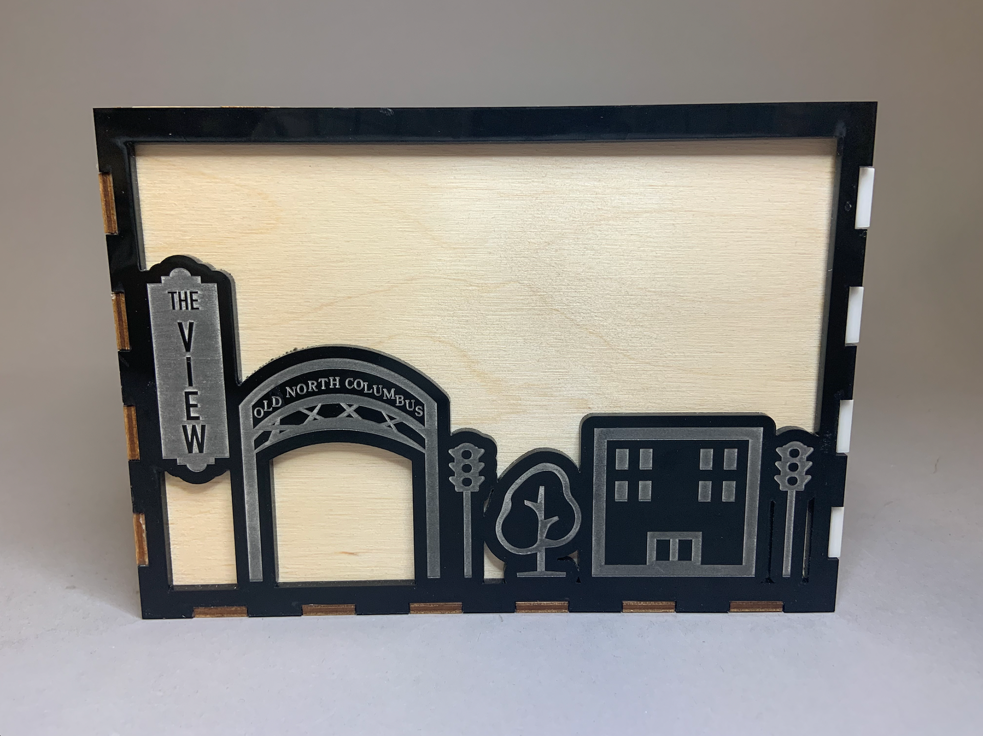
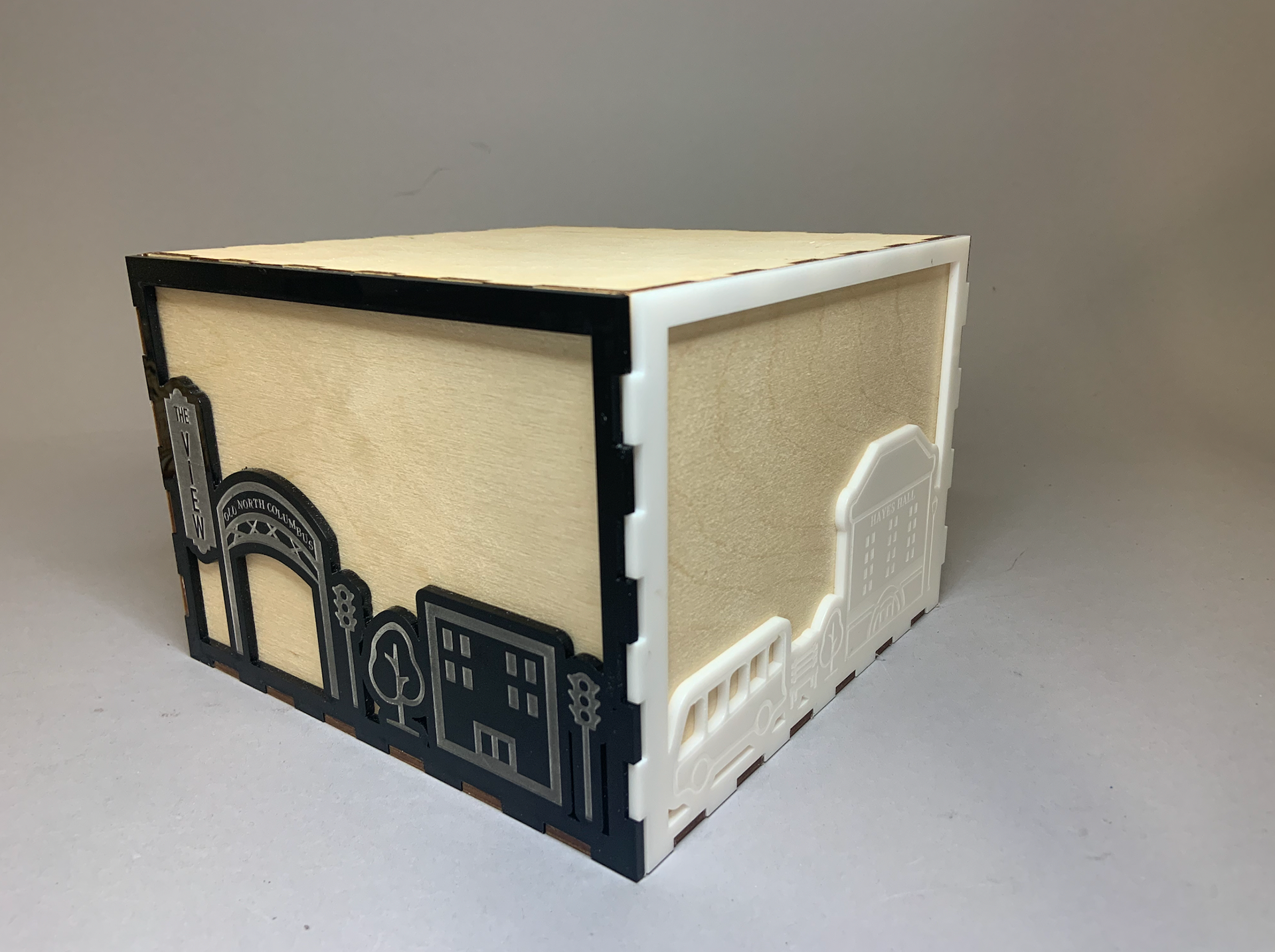
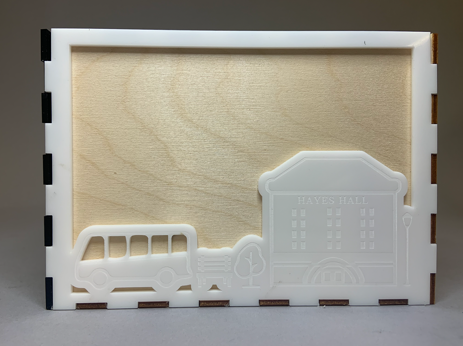
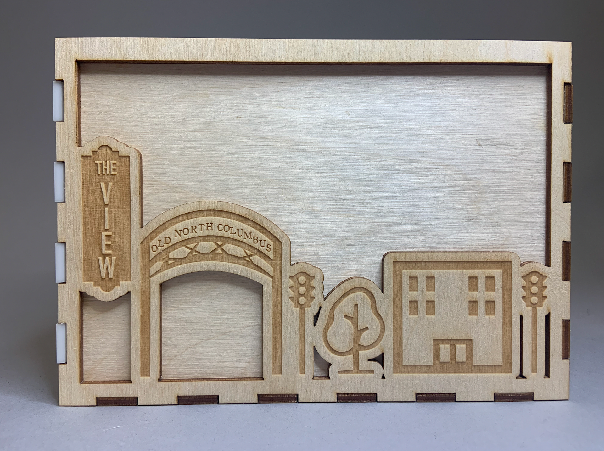
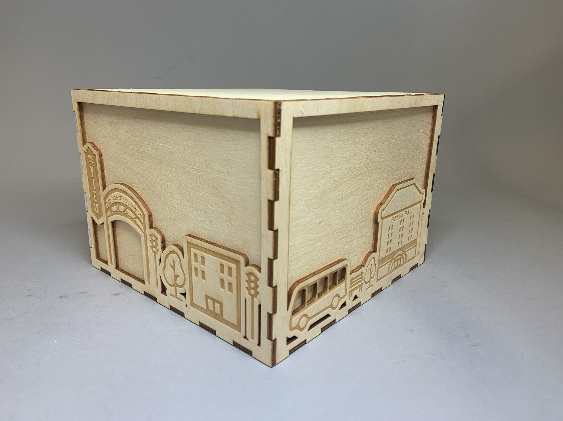
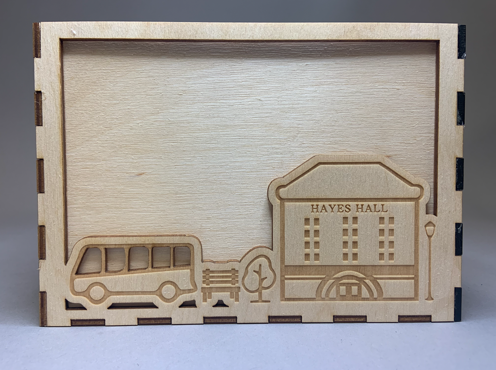
The package for the gift consists of two different materials: plywood and acrylic (black and white). This refers to the quote, “I like things to be modern and still have a bit of tradition.” Since the wooden texture is more traditional, the smooth and reflective acrylic is a more modern material. Also, my mentor loves to play piano, so I used black and white acrylic. The fingers of the box also refer to the piano’s keys.
The illustration on the package is the city line of her route to class, from her home to Hayes Hall. This represents her life in the state as a design student.
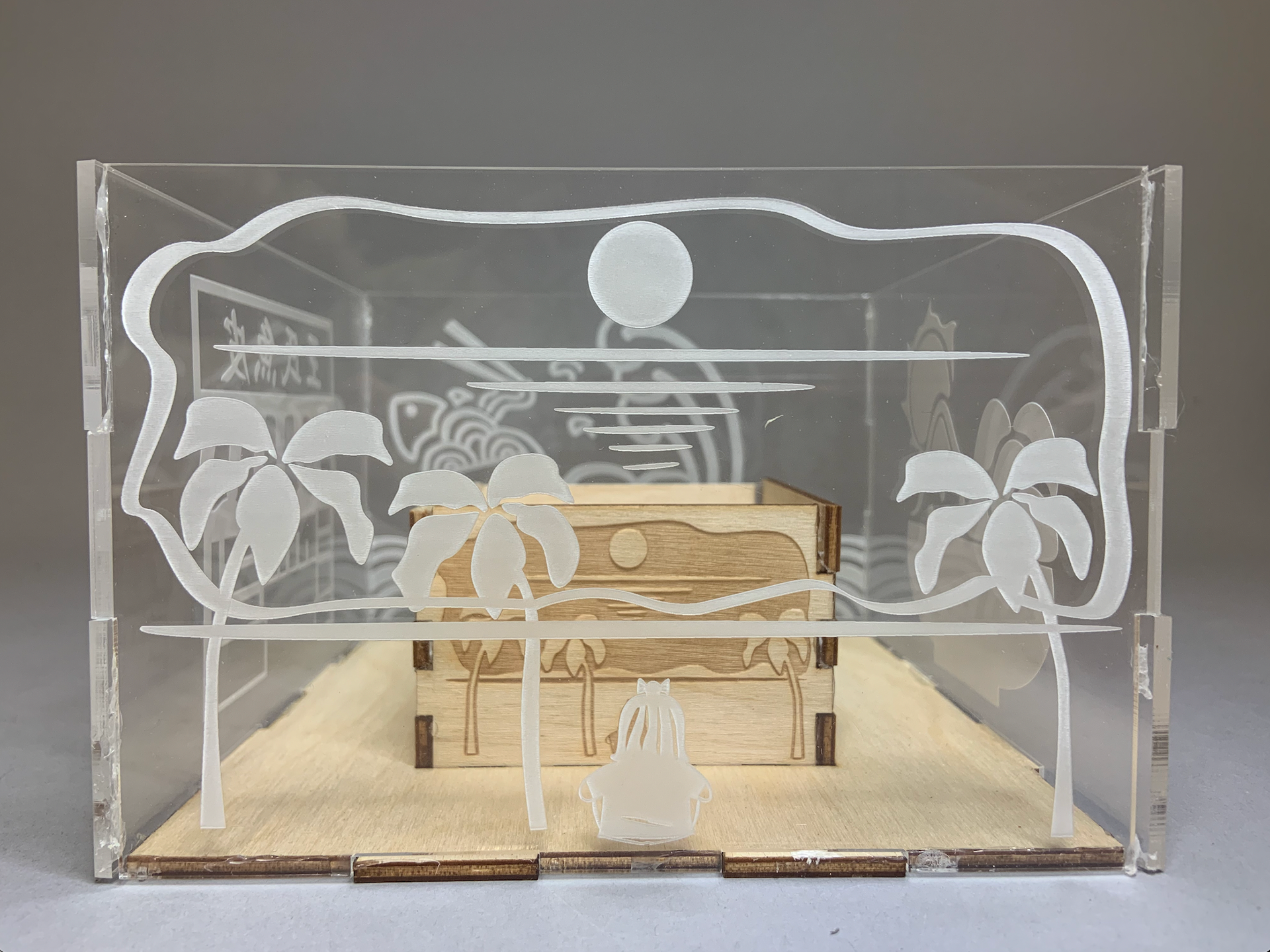
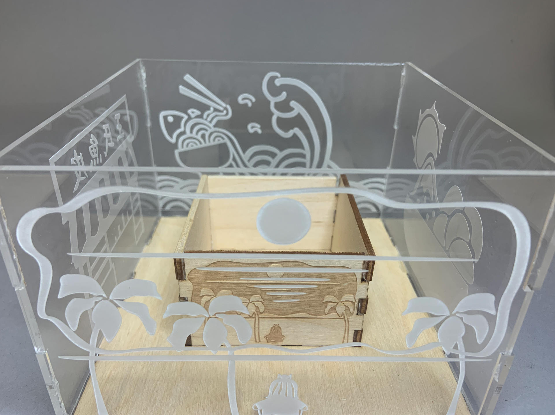
The beach scene on this side of my gift is a special memory for Sabrina. This is the beach where she and her father used to stop during her childhood.
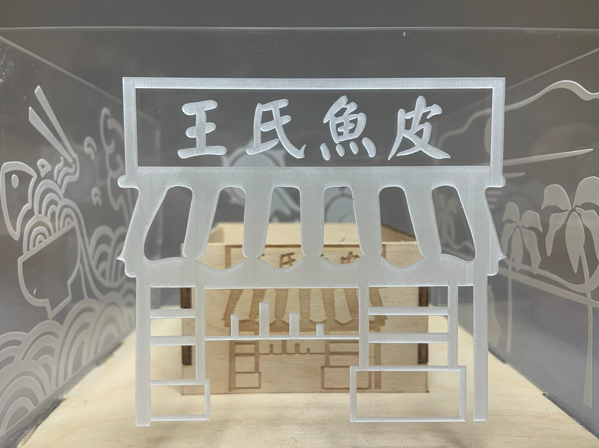
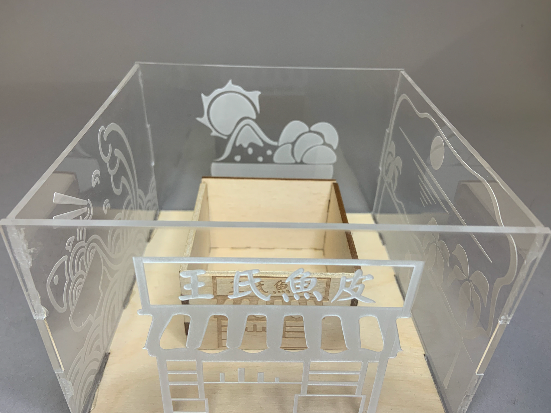
This scene is Sabrina’s favorite traditional restaurant in her city. I used simple line work instead of realistic illustrations to present the scene.
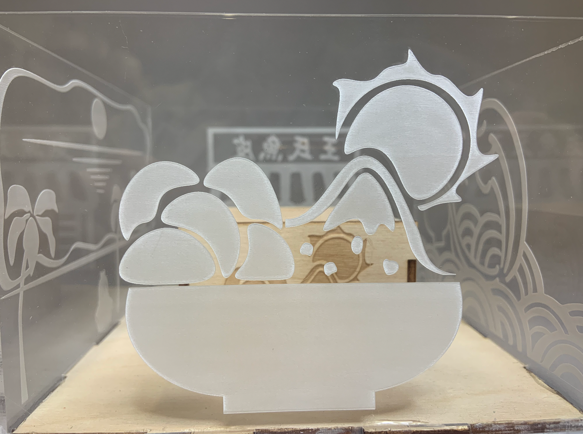
This is one of my recipient’s favorite desserts, shaved ice, in her hometown. I combined the dessert with the mountain scene since Taiwan is a little island country known for its numerous mountains.
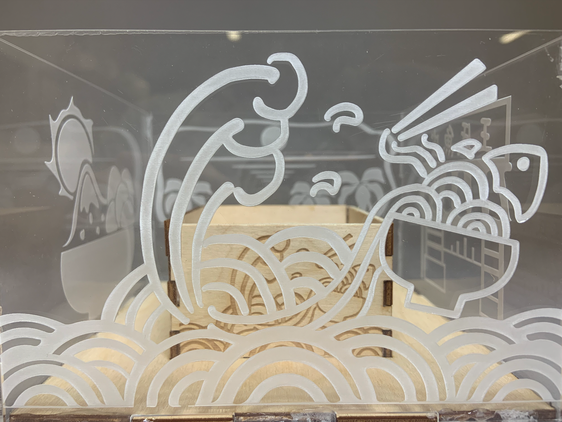
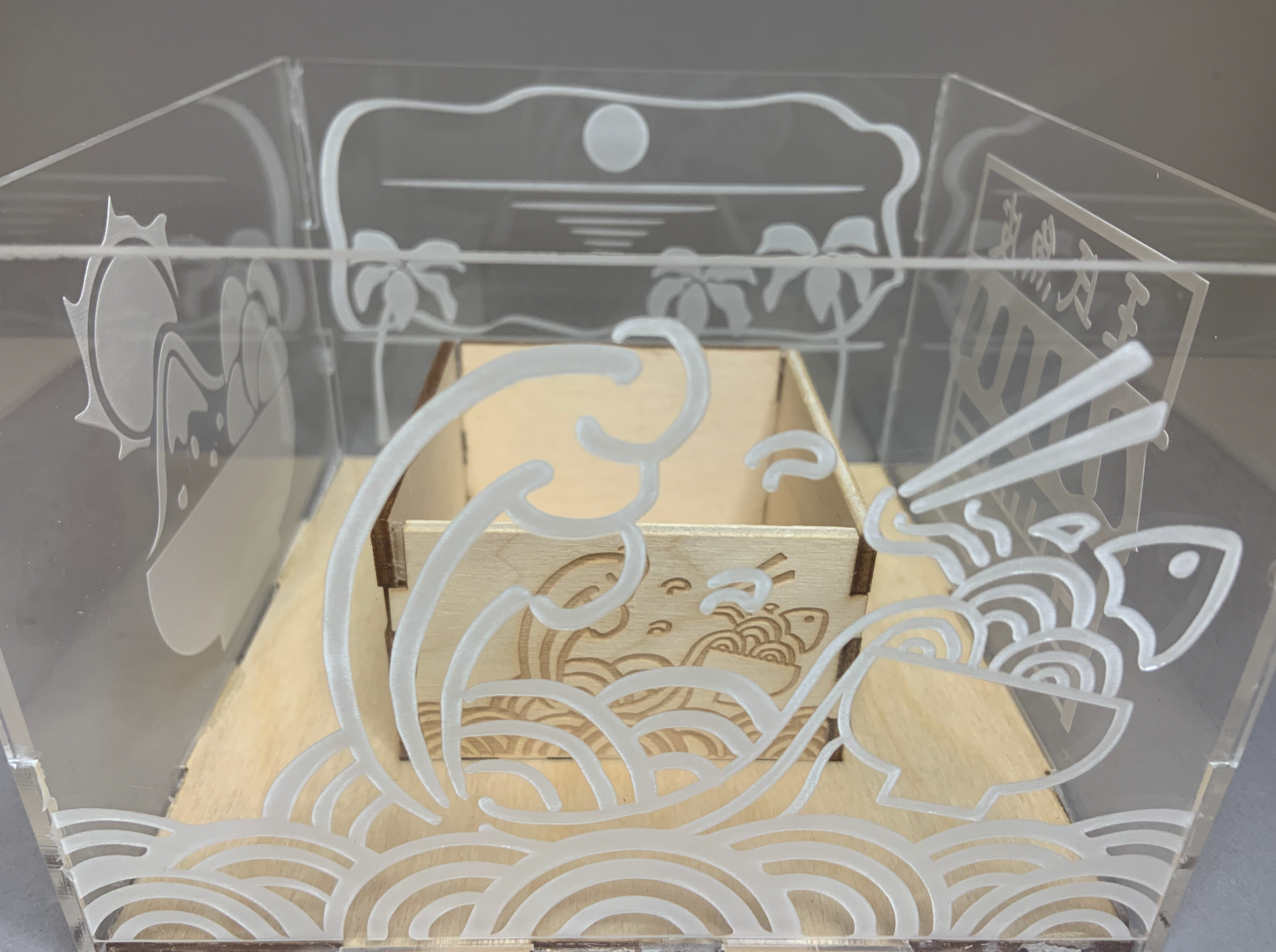
This is one of Sabrina’s favorite foods, fish noodles, in her hometown. I connected the noodle to the ocean and wave to make it more vivid.
